Home Design Mistakes People Make With Windows
These are 5 interior fashion mistakes homeowners make with their windows, and how you can avoid them.
Mistake: Mismatched Colors Facing Out the Window
It’s great to vary up the look and feel of the different rooms in your home, but sometimes homeowners neglect to think about the look and feel from the outside, where individual rooms don’t matter. So when you put up beige curtains in your living room window, blue shades in the foyer window, and natural wood shutters in the bedroom window that all face the same way – you get a mismatched and gaudy look for any passersby.

Remember the old adage, “go white to the streets,” and standardize your front-facing window treatments. Think classic white shutters or faux-wood blinds on those windows for a classic look outside and a versatile accent on the inside.
Mistake: Using Obviously “Fake” Natural Looks In the Window
Using natural textures and elements in your interior is always a good idea. Nature-inspired looks make homes feel more cozy, inviting, and stylish. But beware of the kind of home decor elements that try to look natural while being obviously synthetic. We’re talking about things like leopard-print drapes, cheap imitation wood flooring, or excessive use of tarnished metals when they don’t fit.
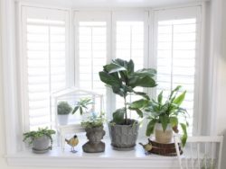
Photo Credit: Amy at White Cottage Home and Living
On the flipside, there are window treatments that don’t try to be more than what they are. Like Polywood plantation shutters. While they’re synthetic, they still convey the look and feel of natural wood shutters without going overboard on trying to look natural with fake colors or textures.
Mistake: Not Utilizing Enough Light Sources
Often homeowners think a singular overhead light is enough to make a room look good. However, there’s a difference between having enough light to see in a room and having enough light to make the room look its best. Solitary overhead lights can make a room seem stretched and washed out.

Instead, try to layer your lighting and use multiple light sources. Use small lamps, strategically placed mirrors to reflect light, and especially make use of natural light. A window treatment that you can easily adjust like shutters or high-quality blinds to angle light can be a godsend when you’re missing that element of dynamic lighting.
Mistake: Rooms Looking Too Similar or Not Similar Enough
If you decorate each room in your home too similarly, none of them stand out. If they’re wildly different, it can be kind of jarring for guests to transition from one to the other and for the whole house to flow.
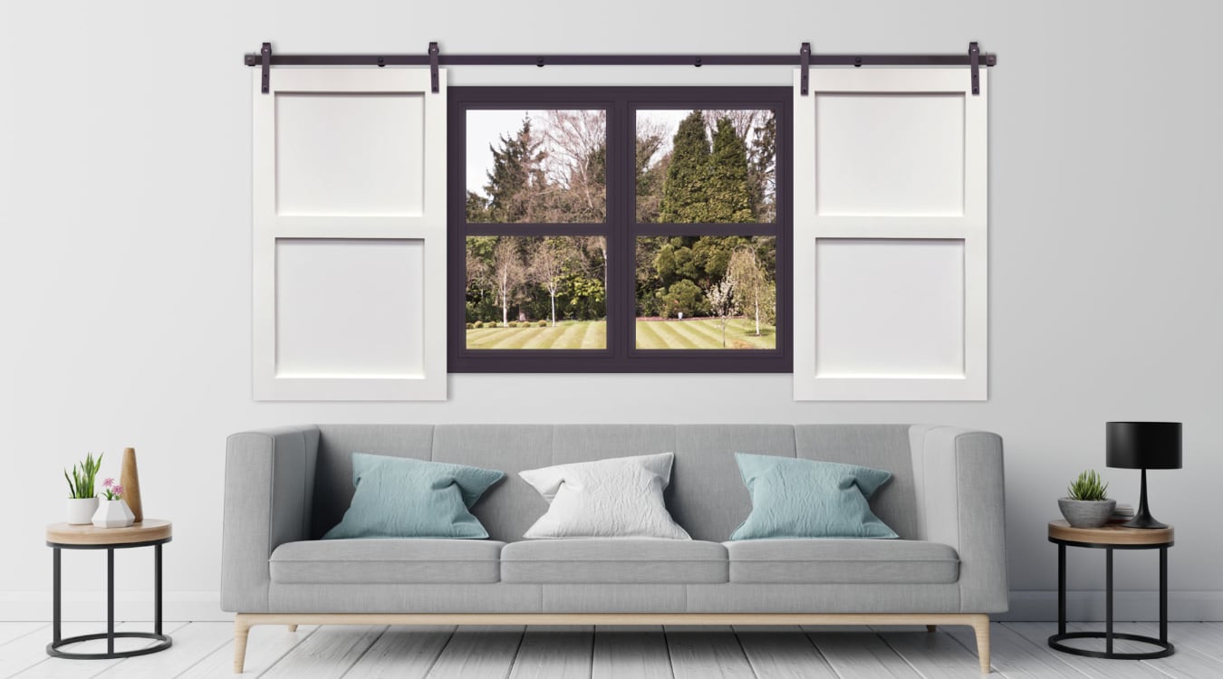
The key here is to let each room have its own unique style and flair but to keep some throughlines throughout your entire home. They could be something like the style of furniture, similar flooring or wainscoting, or something like throwing a rustic element into each room like an old rocking chair or sliding barn door on a closet.
Mistake: Shoving All Furniture Against the Wall
For homeowners who don’t have a plan before they start a redesign, it’s easy to fall into just lining up your sofa, dressers, and shelving against opposite walls. That’s bad for a number of reasons: it doesn’t actually save space, it limits what you can do with your walls, and it’s just kind of boring. Maybe worst of all, it downplays your windows, which are a natural focal point for any room.
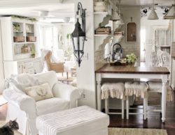
Photo credit: Terri Baker at Simply French Market
Try to strategically place furniture throughout your space, taking into consideration how the light hits different parts of your room, and how you want to use it. There’s no rule that everybody sitting in a room has to be facing the exact center.
Let Sunburst Help You Avoid More Window Design Mistakes
For a free consultation on how to better use new window treatments in your home design, call Sunburst today at 877-786-2877 or use the form below. We’ll meet you at your own home to walk you through any options for your redesign.

Kurt Taylor is a seasoned professional with a Juris Doctorate degree from Brigham Young University. In addition to starting his own private practice, he has experience in corporate law. Kurt serves as Sunburst’s in-house legal counsel and Chief Operations Officer, supervising legal affairs, corporate governance, ethics and compliance, intellectual property, financial transactions and general corporate matters. He provides leadership and direction to the company’s management staff and outside counsel.
FAVORITE SHUTTER STORY: Learning that our shutters made a Nashville customer so happy that she cried throughout the installation. That’s amazing.


